Designed a way to convey openpilot’s driving confidence to the user while engaged.

Challenge
Design a way to convey openpilot’s driving confidence to the user while engaged, in a clear and non-intrusive way — including how close the system is to physical limits.
Key problem
Drivers currently receive alerts only when the system is about to fail, with limited ability to anticipate or understand the system's real-time confidence level.
How it works
Openpilot is a Level 2 driver assistance system that knows when it’s likely to make a mistake.
It distinguishes between 3 levels of system confidence:

Pretty reliable

May or may not work

Expected to not work
User Goals & Use Cases

Stay Aware of Driving Conditions
Understand when openpilot is likely to disengage or struggle with the current driving situation.

Anticipate Intervention Needs
Know when human intervention may be needed before audible alerts.

Build Trust with the System
Clear, continuous feedback builds confidence in openpilot’s abilities and limitations.

Age: 30s, tech-forward, early adopter
Drives: Commutes daily + road trips on weekends
Motivation: Wants the benefits of semi-autonomy without losing control
Frustrations: Gets annoyed when systems fail without warning, hates sudden loud alerts
Behavior: Tends to glance at the screen while driving, relies on haptic/visual cues
Know how well openpilot is currently driving
Get subtle cues if the system is approaching a failure or limit
Quickly understand what the system can’t handle in the moment
Stay focused on the road, not overwhelmed by UI
Know when to disengage or be ready to take control
Builds trust, reduces surprise takeovers
Gives time to react calmly, avoids panic
Helps make fast, informed decisions
Safety-critical, minimizes cognitive load
Encourages shared control instead of over-reliance
Initial concept
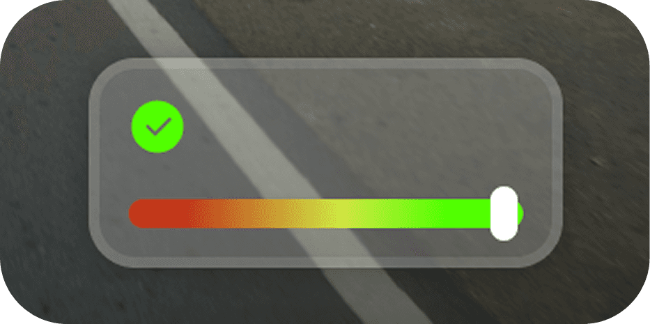
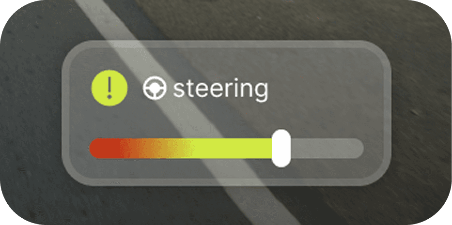
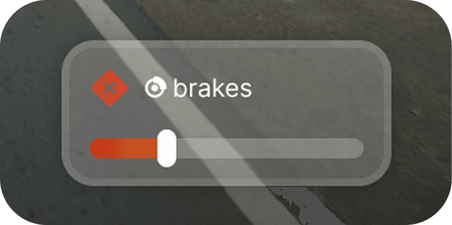
Mini HUD Widget
I began by exploring a compact, vertical confidence meter placed at the bottom-right corner of the screen. This bar would subtly update in color and fill level as system confidence changed.
Behavior:
horizontal Bars fill toward limit
Color shifts from green → orange → red as each nears max
When maxed: pulse red + optional tooltip like “Steering Limit Reached”
🟢 Pros:
Clean and minimal
Out of the way of primary driving content
Easy to read at a glance when desired
Requires a saccade (eye movement) away from the road
Peripheral visibility may not be strong enough during critical moments
Too subtle during urgent changes
At first, I believed this widget was the perfect solution: small, elegant, and quiet. But the more I empathized with the mental state of the driver, the more I realized…

Good design isn’t just what’s elegant, it’s what supports real human behavior.
Initial concept
As I immersed myself deeper in the problem space, a few insights emerged:
- Drivers need to stay focused on the road—not on reading interfaces
- Peripheral vision is powerful—but underused in most vehicle UIs
- A static HUD doesn’t give enough warning time before disengagement
- Repeated audible alerts lead to alert fatigue
Multi-Layered Feedback System

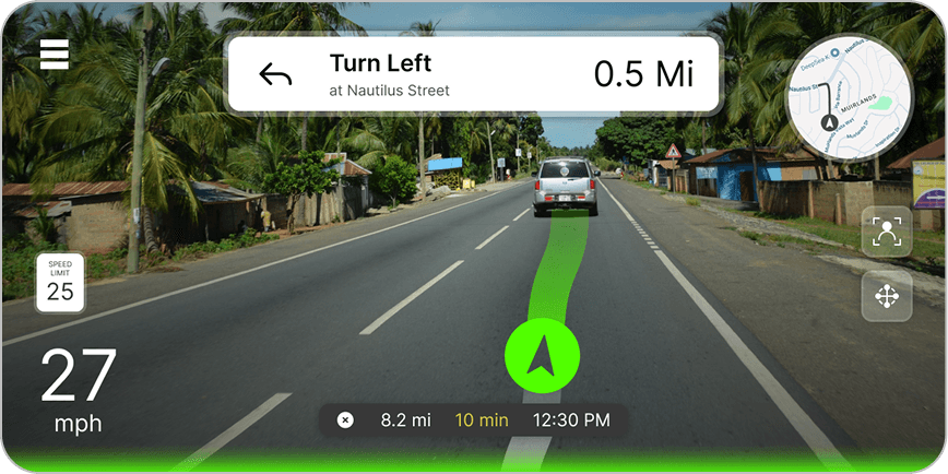
1. Ambient Visual + Peripheral Awareness (default state)
→ Use a soft color glow or subtle motion halo around the screen—enough to notice with peripheral vision, especially for confidence level transitions.

2. Mini HUD Widget (ongoing status)
→ Keep the vertical bar as a persistent "confidence meter"—useful for quick glances and mental confirmation.

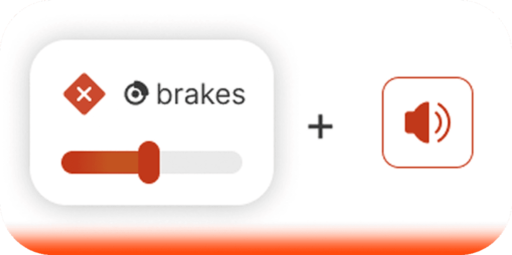
3. Predictive Cue + Gentle Audio Prompt (pre-alert phase)
→ Instead of only playing sounds at the moment of failure, introduce “pre-alert” tones when confidence drops or torque/limit is nearing.
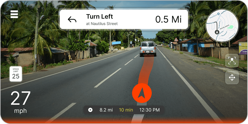
4. Critical Alert Mode (high risk)
→ When it’s about to disengage: stronger sound + halo flash + mini HUD animation. Must be brief, clear, and escalate only when necessary.
Ambient Glow (Peripheral Visual Layer)

A soft, halo-like light around the screen subtly shifts in hue and brightness based on confidence level.
It’s:
- Constantly visible in peripheral vision
- Calm and unobtrusive when confidence is high
- Pulsing and slightly brighter when confidence drops

Mini HUD Widget (Status Reference Layer)

The original vertical bar remains, but is now treated as:
- A persistent “confidence meter”
- A reference, not the primary alert
- Useful for passengers or curious drivers
Predictive Tone (Pre-Alert Layer)

A gentle sound plays when confidence is starting to fall—before a major disengagement alert. Think of it as a nudge, not a siren:
- Short, pleasant tone
- Easy to associate with a state change


Escalation Phase (High Risk)

When confidence drops drastically:
- Glow brightens or pulses faster
- Mini HUD animates slightly
- Warning message +Louder tone signals immediate attention
Together, these elements form a graduated system: not all-or-nothing, but layered to support awareness over time.
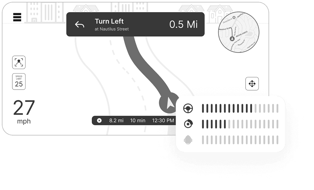
Improving Screen Real Estate (Bonus)
While working on the confidence feedback UI, I also took a step back to examine how the current openpilot UI uses screen space.
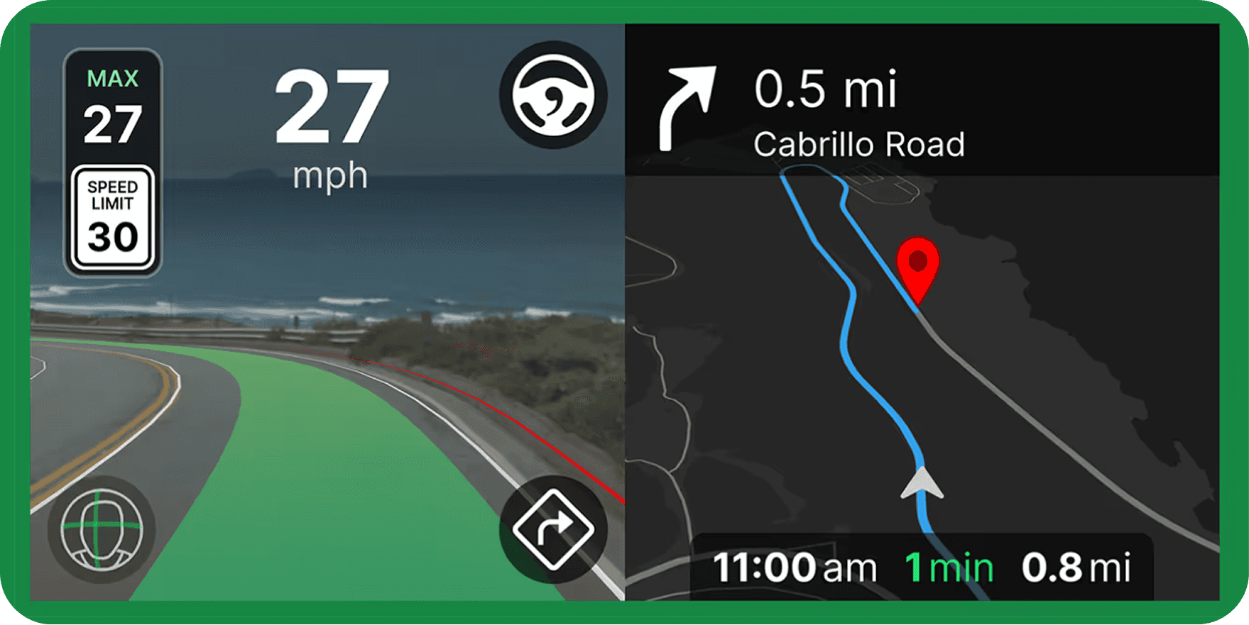
The current layout splits the screen in half:
Left: Camera view + driving UI
Right: Map/GPS interface
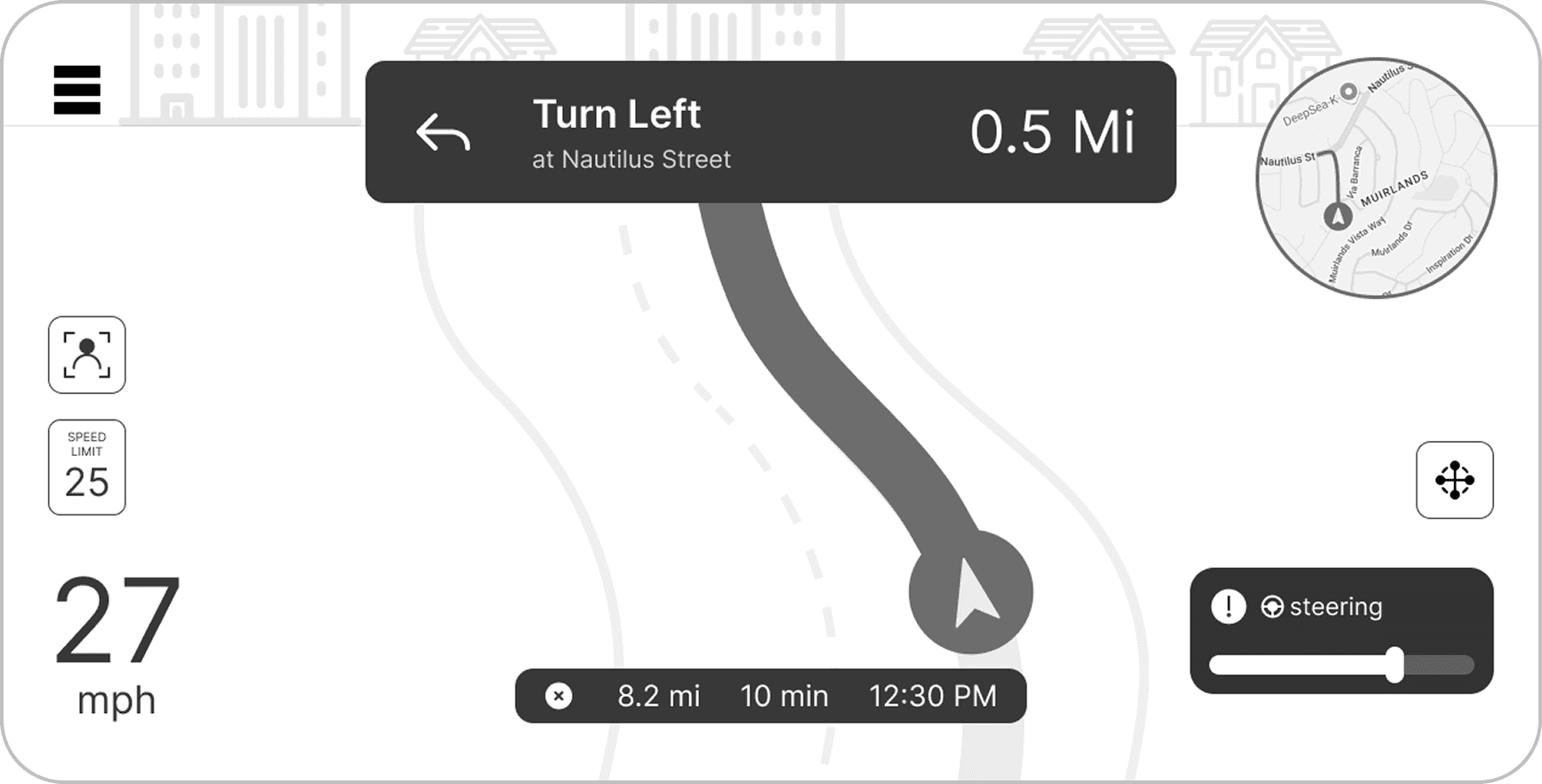
During active driving, the camera view is more relevant to the driver’s safety and trust than a full-size map. Navigation is important, but it doesn’t require constant attention
Proposed Enhancement
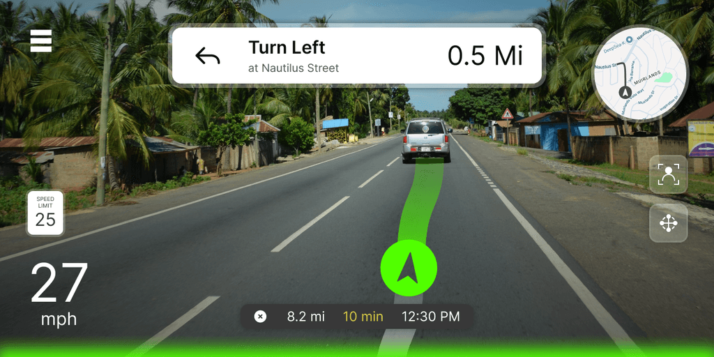
Full-Screen Camera + Driving UI
→ The camera view and autopilot interface now take up the full display
→ Confidence feedback layers (Halo, Mini HUD, tones) are shown directly on top
Collapsed Map Widget
→ Map minimized to a radar-style widget in the lower-left corner
→ Tappable/expandable if the driver wants to see more
→ Shows turn-by-turn and route preview in compact form
Takeaways & Learnings
Assumptions evolve
My initial confidence in the mini HUD showed the importance of testing ideas against real human behavior
Peripheral feedback is underrated
Designing for non-focal attention can be more effective than trying to compete for focus
Progressive design builds trust
Instead of overwhelming users, we can escalate feedback as the situation evolves